Design plays a bigger role in performance than most people expect. A well-targeted campaign can still fall flat if the piece itself doesn’t capture attention or guide the reader toward action. That’s why businesses using direct mail in Santa Fe, NM, benefit from putting just as much thought into design as they do into messaging and targeting.
Good design doesn’t just make your mail look better. It makes it easier to read, easier to understand and more likely to get a response.
Here’s how to design direct mail pieces that actually perform.
Start With One Clear Goal
Every design decision should support a single objective. Before you begin, ask:
- What action do I want the reader to take?
- Call your business?
- Visit your website?
- Redeem an offer?
When your goal is clear, your design becomes more focused. Trying to promote too many things at once often leads to confusion and lower response rates.
Make the Headline Do the Heavy Lifting
Your headline is the first thing people notice. It should:
- Be easy to read at a glance
- Highlight a clear benefit
- Create enough interest to keep reading
Think of it as your first and best chance to stop someone from tossing the piece aside.
Keep the Layout Clean and Easy to Follow
Clutter is one of the fastest ways to lose attention. A strong layout:
- Uses whitespace to separate sections
- Guides the eye from headline to offer to call to action
- Avoids cramming too much into a small space
If someone has to work to understand your message, they probably won’t.
Focus on One Strong Offer
Your design should revolve around a single, clear offer. Make it:
- Easy to find
- Easy to understand
- Easy to act on
Whether it’s a discount, free consultation or limited-time promotion, the offer should stand out visually without competing elements around it.
Use Color With Purpose
Color isn’t just decorative. It helps direct attention. Use it to:
- Highlight your call to action
- Create contrast for readability
- Reinforce your brand identity
Too many colors can feel chaotic. A focused color palette keeps your design cohesive and easier to process.
Make Your Call to Action Impossible to Miss
If someone is interested, the next step should be obvious. Your call to action should:
Stand out visually
Use clear, direct language
Be repeated if necessary
Examples include:
- Call today
- Scan to learn more
- Visit our website
Don’t assume people will figure out what to do next. Show them.
Choose Readable Fonts and Sizes
Design trends come and go, but readability always matters. Stick with:
- Clean, legible fonts
- Font sizes that work at arm’s length
- Strong contrast between text and background
If your text is hard to read, your message gets lost.
Incorporate Trackable Elements
Good design also supports measurement. Consider adding:
- QR codes linked to landing pages
- Custom URLs
- Promo codes
- Dedicated phone numbers
These elements should feel integrated into the design, not added as an afterthought.
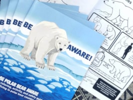
Use High-Quality Images (When They Add Value)
Images should support your message, not distract from it. Use visuals that:
- Reflect your product or service
- Reinforce your offer
- Help tell a clear story
Avoid generic or overly busy images that compete with your message.
Design for the Real World
Remember how your mail piece will actually be used. It may be:
- Viewed quickly over a kitchen counter
- Set aside and revisited later
- Competing with other mail
That’s why clarity and simplicity matter so much. Your design needs to work in real-life conditions, not just on a screen.
Common Design Mistakes to Avoid
Even small issues can impact performance. Watch for:
- Overloading the piece with too much information
- Weak or unclear hierarchy
- Low contrast that reduces readability
- Multiple competing calls to action
Fixing these often leads to immediate improvements.
Bringing It All Together
Effective direct mail design isn’t about making something look impressive. It’s about making it work. When your design:
- Supports a clear goal
- Guides the reader naturally
- Highlights a strong offer
- Makes action easy
your response rates tend to follow.
Design That Drives Results
At the end of the day, design is more than appearance. It’s a tool. When you use it intentionally, your direct mail becomes easier to read, easier to act on and more likely to deliver the results you’re looking for.